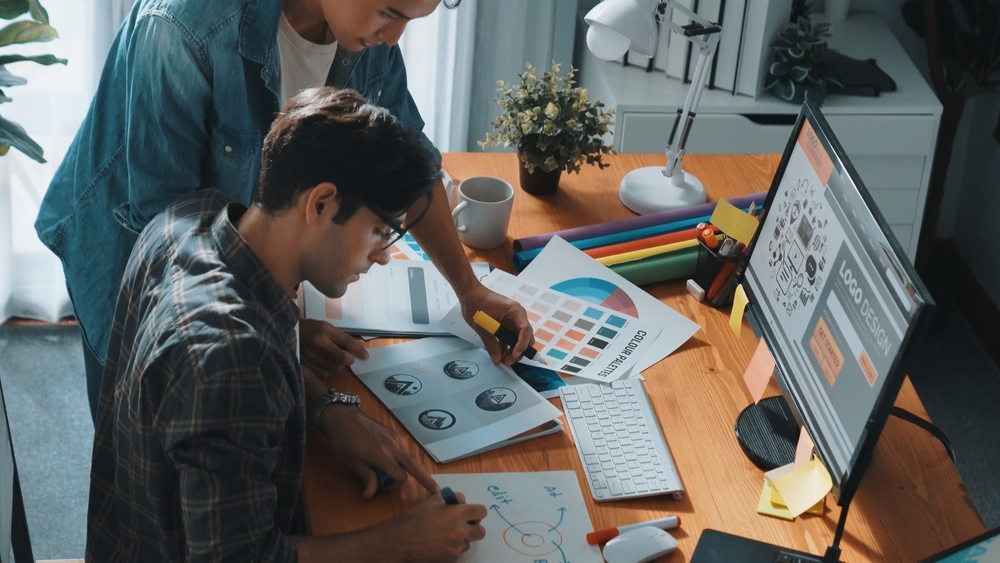
One of our favorite things at Candy Draw is working with clients to build their brand identity. It’s an exciting process where you see the company’s personality take shape. In simple terms, it involves selecting colors, fonts, an icon and logo formats, all driven by your company’s attributes, customer preferences and competitor brands.
With the explosion of AI logo generators, anyone can build a brand. It’s amazing and empowering because you feel more connected to your brand.
As fun as it is to build a brand, there are a few tricks we recommend at Candy Draw to help you along the way.
There are tons of options out there, so we suggest you experiment and see what works for you. At Candy Draw, we recommend Looka. We like it so much that we used it to design our own logo.
The tool should be easy to use and provide lots of options based on your choices. Most importantly, it should show you examples of your logo in real life settings. A standalone logo is great but how it looks in action is what matters.
You might think, “Colors can’t sing.” Well, they absolutely can if you know how to make them. Here’s how:
First, pick at least one dark color that appeals to your customers. For B2B products, a darker the better—we recommend you opt for two.
Next, choose a highlight color. This lighter color will make your branding pop and stand out from the crowd. For B2B, one highlight color works well, while for B2C, we suggest two.
It’s this combination of colors that makes your branding sing and helps you get noticed in a crowded marketplace.
Most brands have an icon or symbol. As a brand manager, your dream is for it to become so recognizable that you can eventually drop your name and just use the icon. Think of when X was still Twitter—just seeing the blue bird was all you needed.
Reaching this level is Nirvana for most brands but until you get there your icon will need to sit next to your brand name.
At Candy Draw, we love icons like most marketing strategists do. We recommend playing around with:
Experiment with different scenarios. It’s a fun exercise but be mindful not to fall down a rabbit hole of options. To stay on track, we suggest viewing how it work in real life. That’s why we love Looka—it lets you do just that!
You’ve got a few logo options you absolutely love but like marriage, you need to see if you can live with that logo day in and day out. On the surface, it may look perfect, but in reality, it might be different.
For example, we worked with a client who initially wanted a vertically aligned logo. Once we showed them how it looked on their website, they quickly switched to a horizontal stacked design.
Another client loved the colors of their logo but realized they were too bold when used in a PowerPoint template. They ended up tweaking the fonts and colors.
With Looka, you can see how your logo will look in real life. Here are a few key places to check:
Take your time and experiment with your brand. Many of our clients end up with something completely different from what they started with after going through this exercise.
We all need a time out sometimes and logo creation is no different. Take a break before finalizing your logo.
Give yourself at least a week before committing. If after that time you still love it, press purchase and begin your branding love affair.
With Candy Draw’s advice and your winning marketing, you’ll be celebrating your logo anniversary for years to come. And if a brand divorce happens, don’t worry—it’s normal. Looka will be there waiting with open arms!
Need help designing your logo? Contact Candy Draw to start the super fun and creative process together!
